[ what if your soda popped both in flavor and style? ]
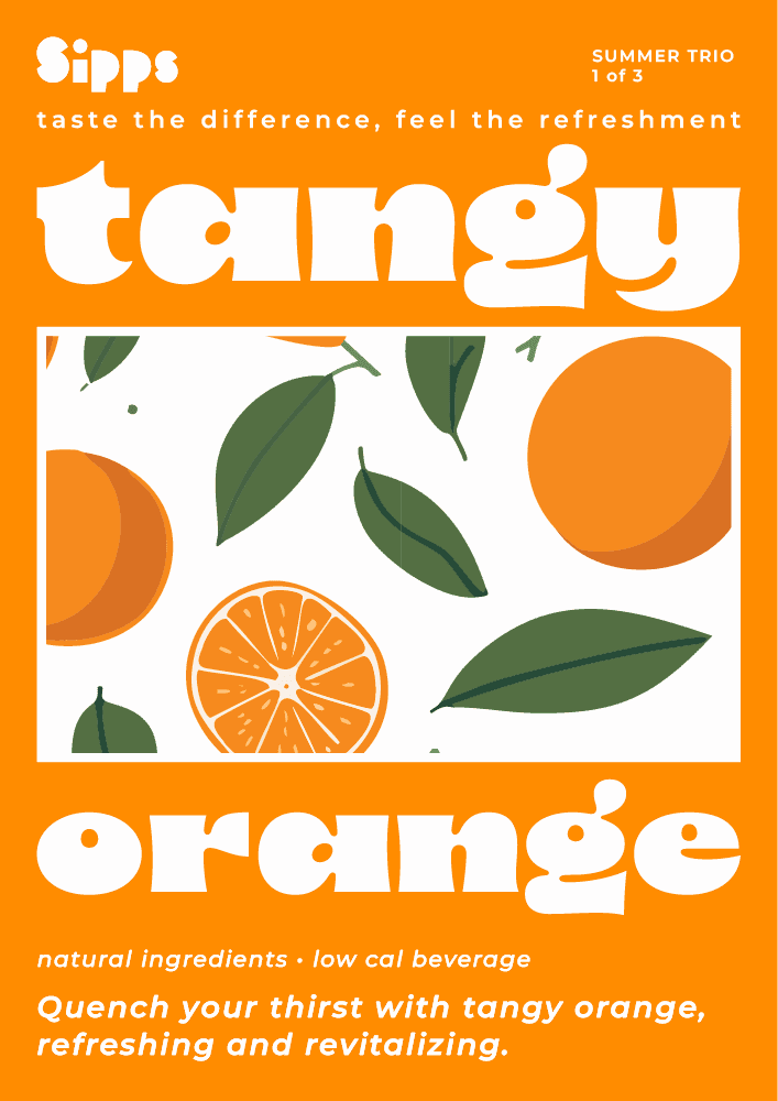
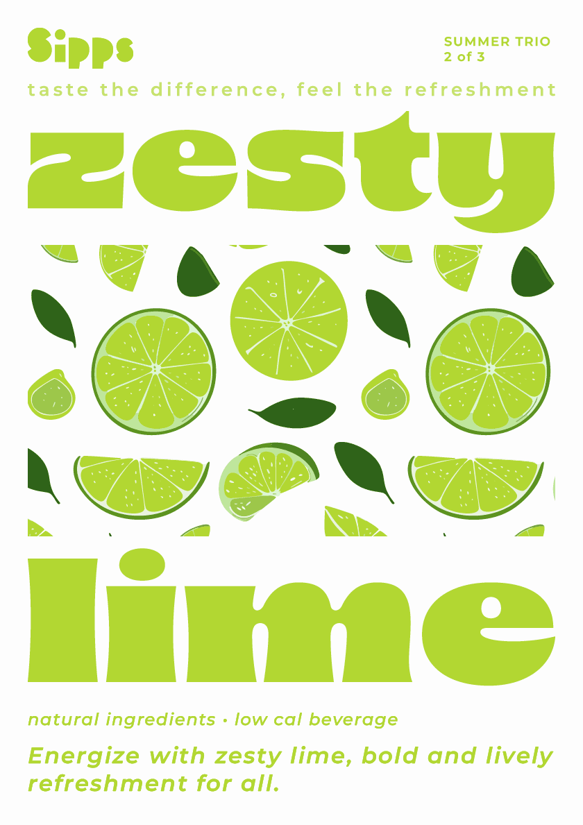
Sipps delivers a vibrant, refreshing experience. The Summer Trio packaging uses bright colors, bold typography, and playful illustrations to reflect each flavor’s personality—Tangy Orange, Zesty Lime, and Lemon Burst.
The cohesive design shines across packaging, posters, and Instagram, capturing the brand’s lively energy.
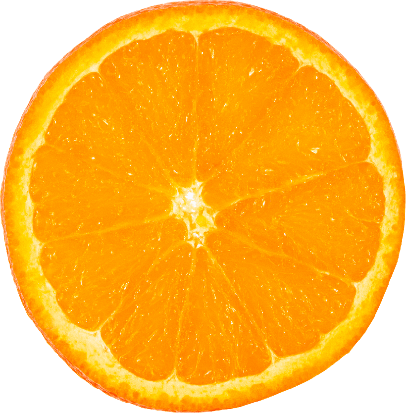

Quench your thirst with tangy orange, refreshing and revitalizing
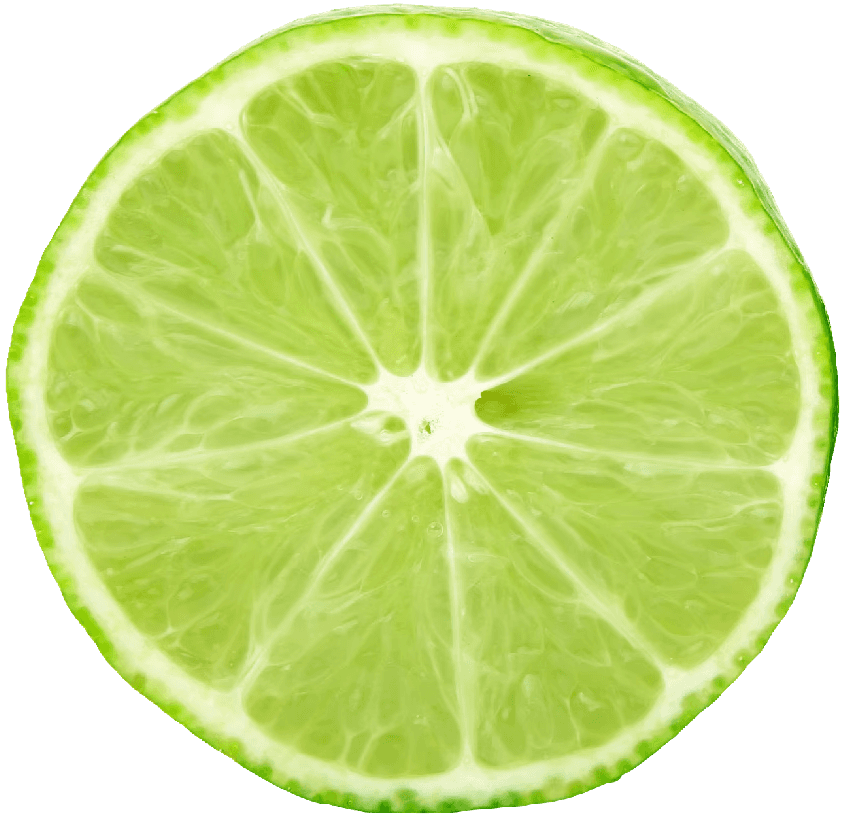

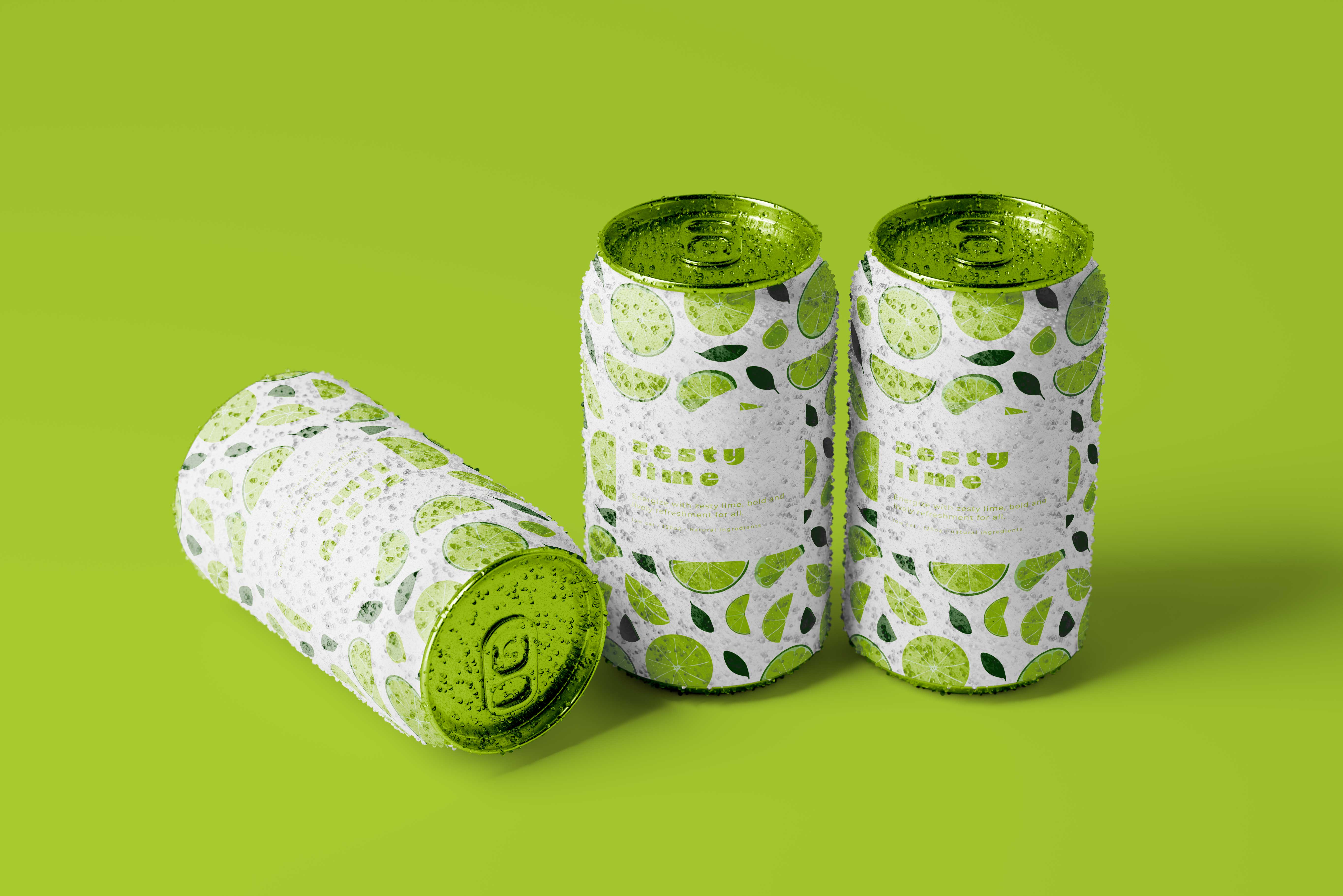
Energize with zesty lime, bold and lively refreshment for all.
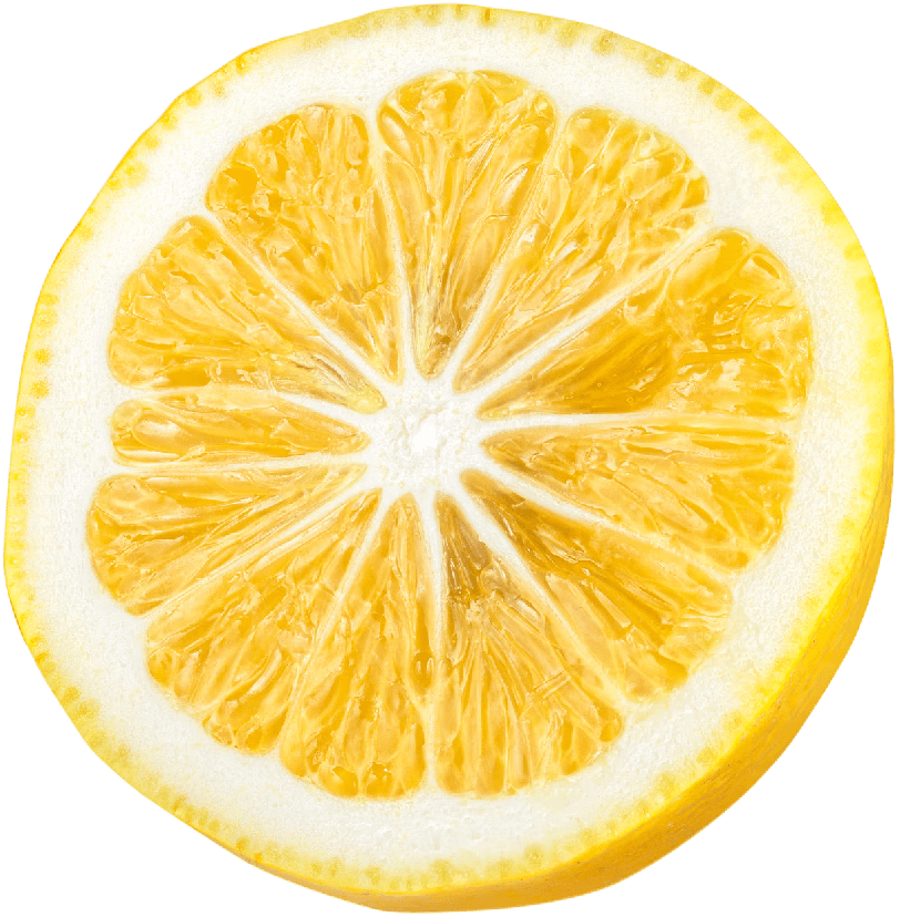

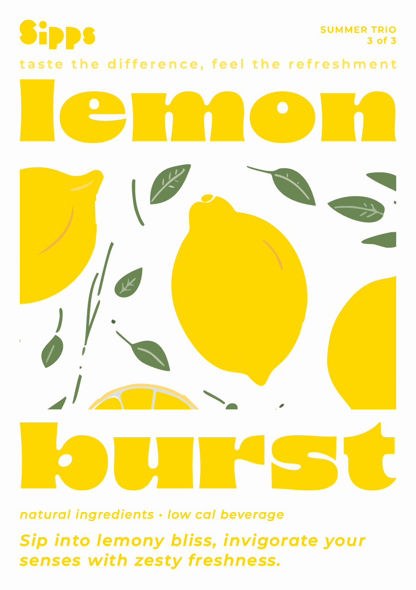
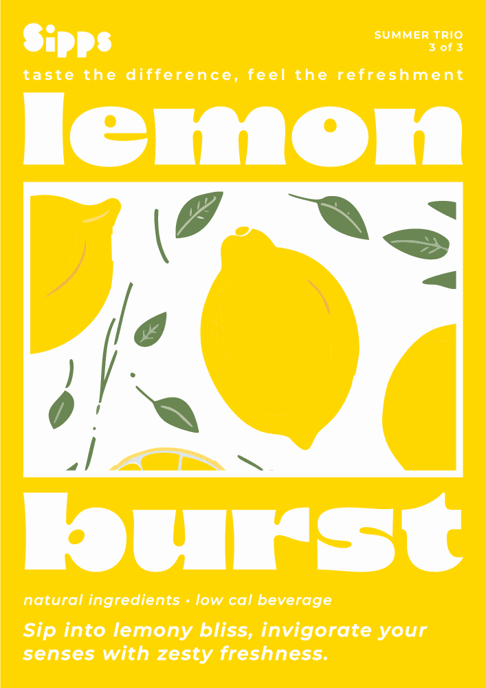
Sip into lemony bliss, invigorate your senses with zesty freshness.
[ Typography & color that's bold and refreshing ]
Typography for Sipps is all about impact—bold, modern headers paired with clean, simple body text. The vibrant color palette reflects each flavor: orange for Tangy Orange, green for Zesty Lime, and yellow for Lemon Burst—creating a fresh, energetic vibe that pops.

[ Packaging Design ]
The soda cans are as refreshing as the drinks inside. Bold colors and playful illustrations make each can stand out, capturing the fun, flavorful personality of every sip.


[ Illustration & Print that puts flavor in the spotlight ]
Eye-catching posters were designed for the Summer Trio, each showcasing vibrant flavors with bold graphics and playful text. These visuals bring the essence of each soda to life.


[ Social posts that bring summer vibes ]
For social media, lifestyle shots were created featuring Sipps cans in sunny, beachy settings—from cans resting in the sand to cans held in hands raised towards the sky. These visuals capture the refreshing essence of each flavor, inviting followers to embrace the perfect summer moment with every sip.