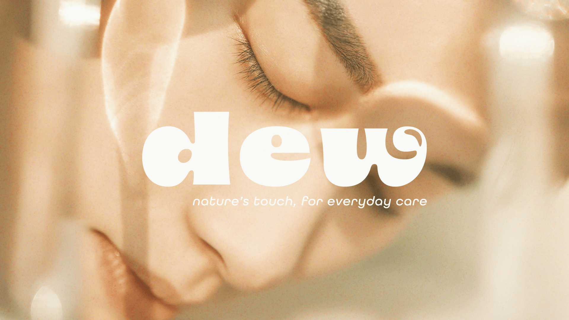
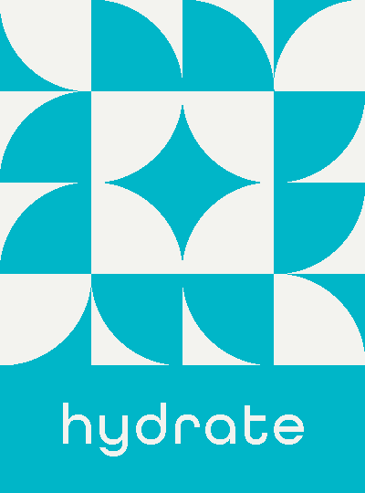
[ Hydrate. Nourish. Glow. Soothe. ]
Dew offers natural skincare and body care essentials to nourish, hydrate, glow, and soothe. The brand identity features a custom logotype, a natural color palette, and a minimal pattern system. Each product is color-coded—green for nourish, blue for hydrate, orange for glow, and pink for soothe—creating a clear, cohesive visual language. The design evokes simplicity and organic beauty, with earthy tones and clean shapes.
scroll to explore the Color palette

Ivory
f3f3ef

Evergreen
19532b

Crystal Clear
00b5c6

Moss
273d31

Citrus
f3835d
Blossom
f59cb0
[ Color & Pattern: Organic and Clean ]
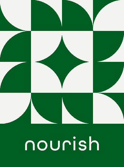
The color palette is simple yet powerful: green for nourish, blue for hydrate, orange for glow, and pink for soothe. The pattern system is minimal and organic, adding texture without overwhelming the design.


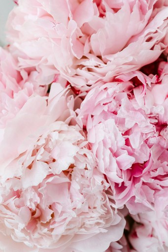
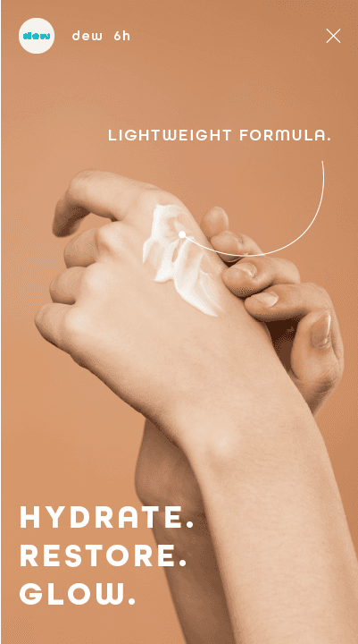
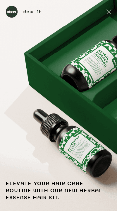
[ Social Media ]
Lifestyle shots reflect Dew’s natural, dreamy aesthetic, with soft lighting and earthy tones. Whether highlighting a product’s benefits or showing it in serene, everyday settings, Dew’s social media captures the fresh, soothing vibe that the brand is all about.


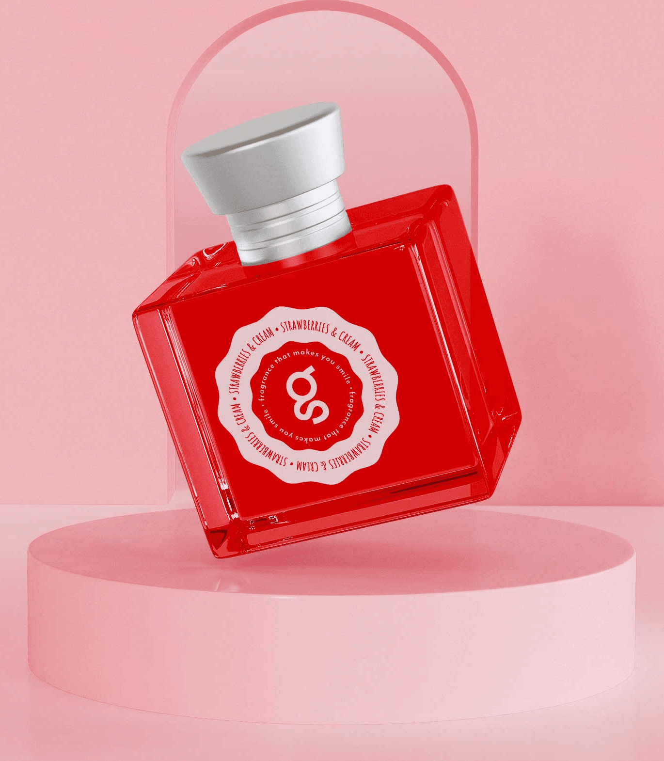
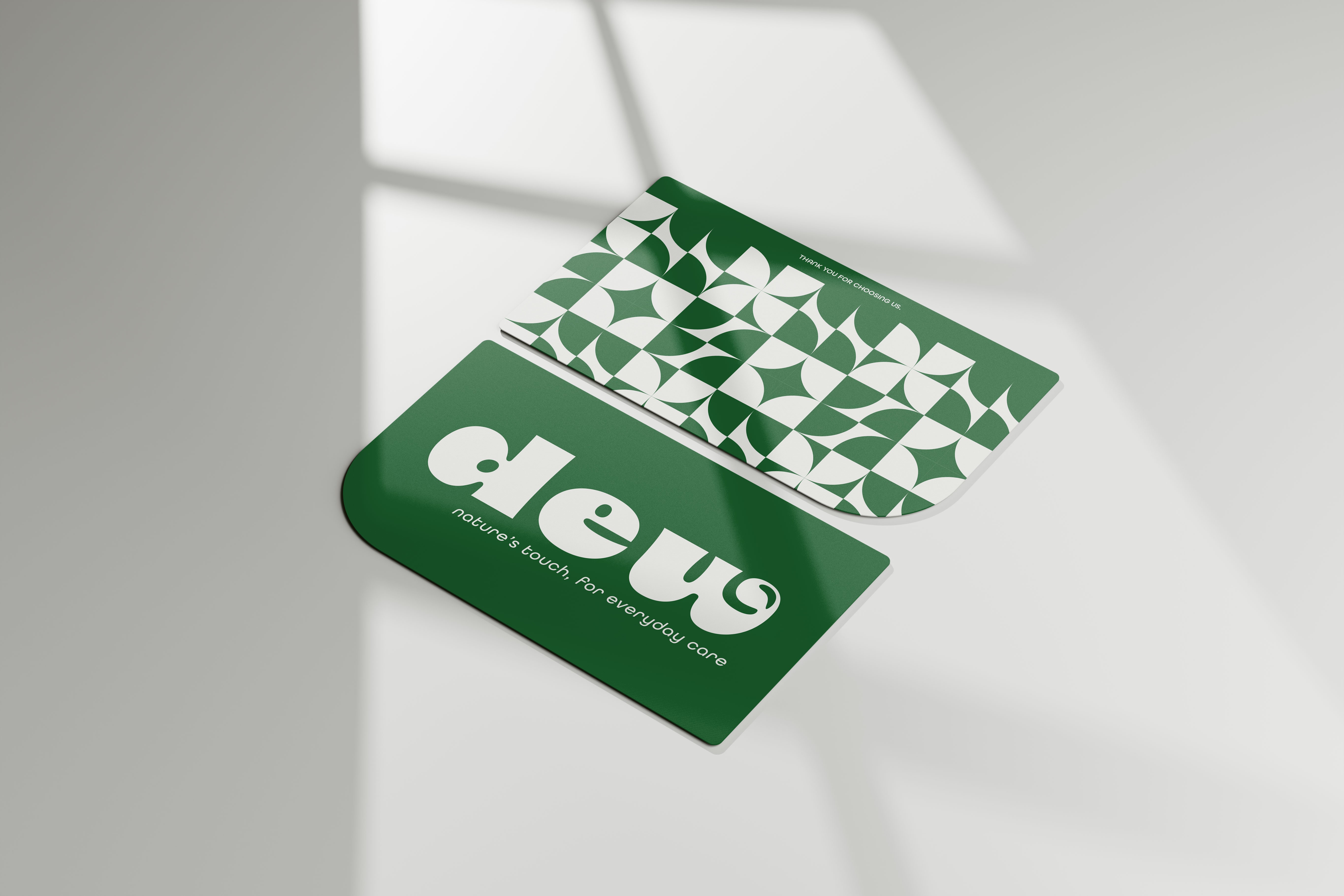
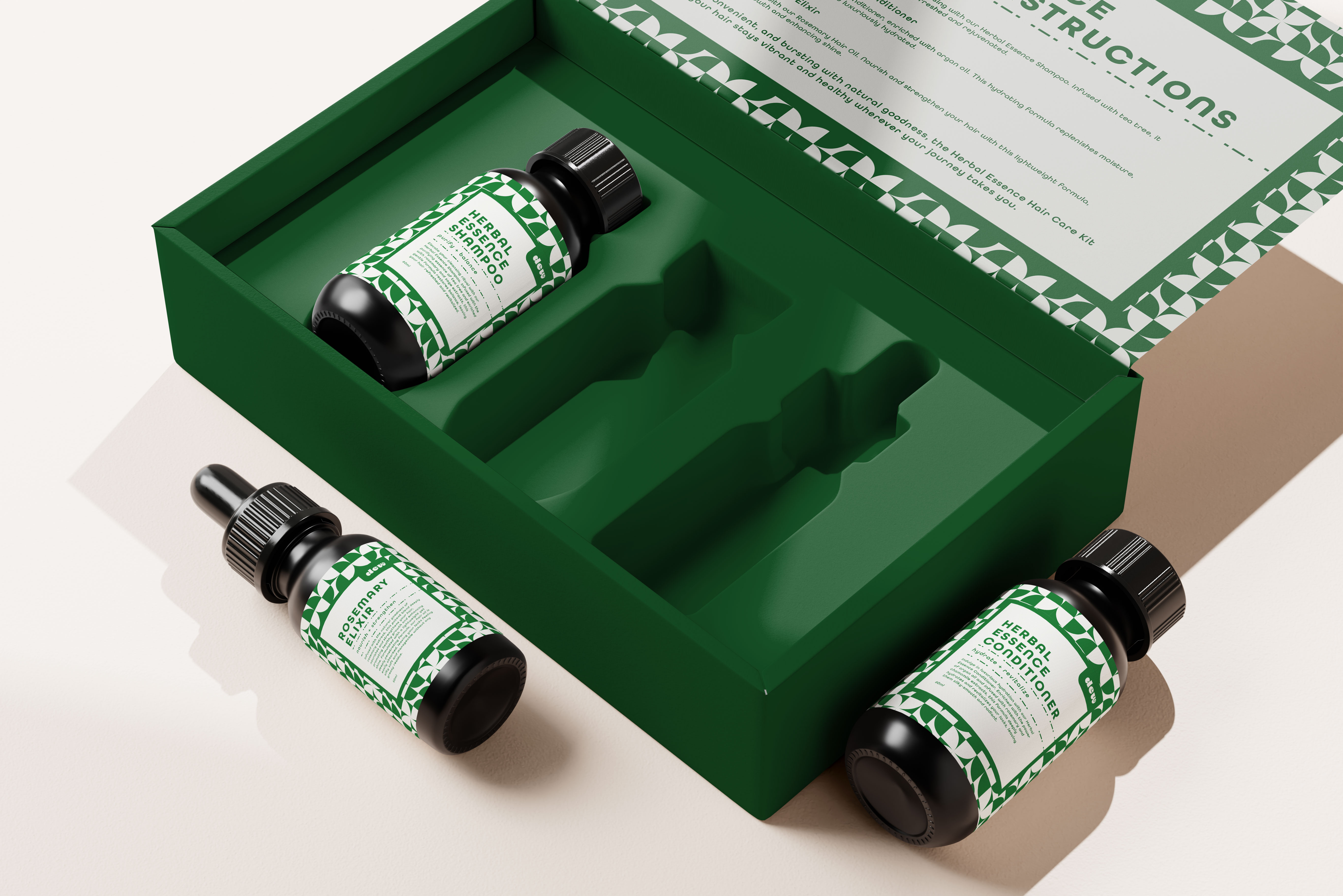
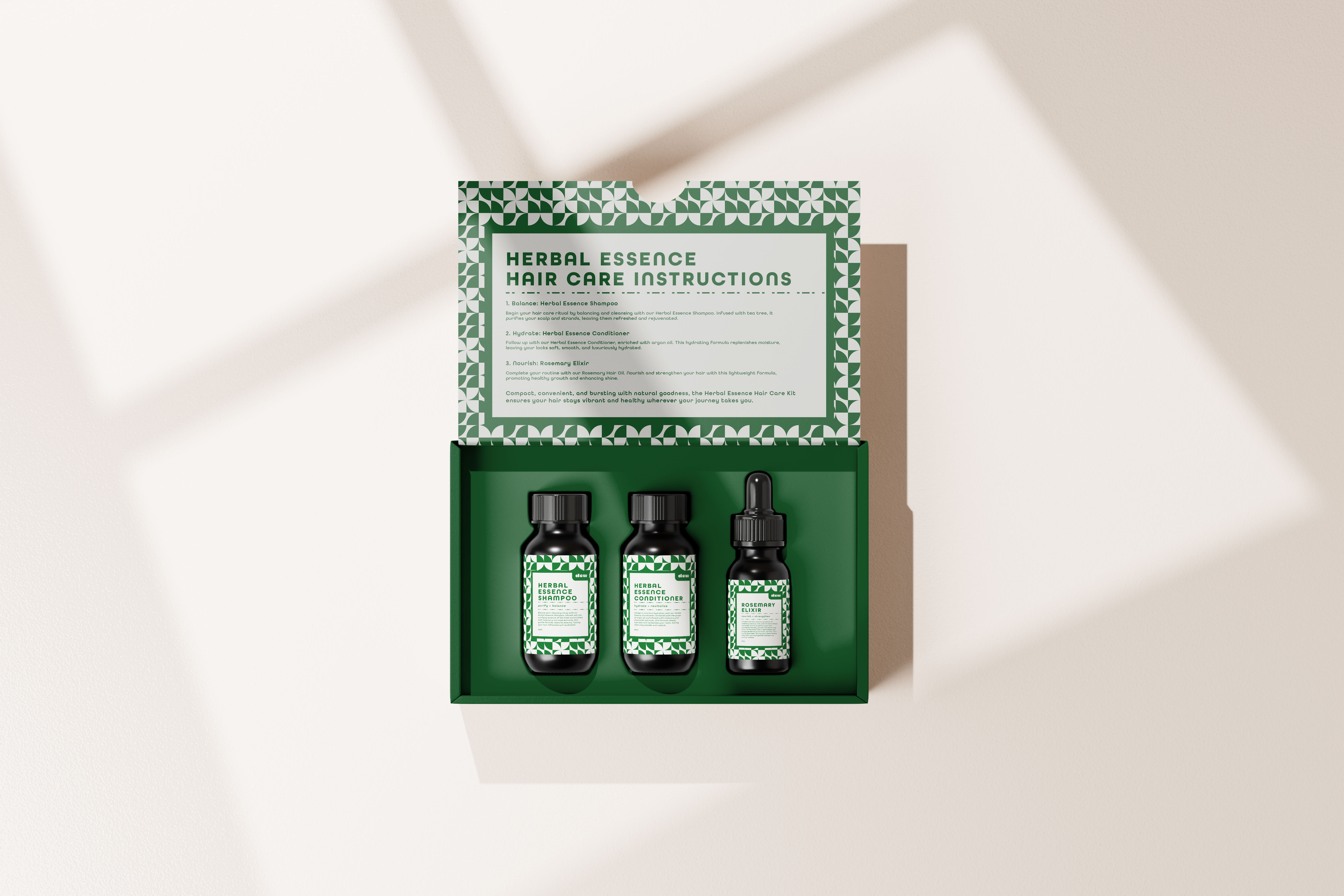
[ Packaging: Minimal & Fresh ]
The packaging combines the pattern system with a minimalist approach, using clean lines and a natural color palette. Each product is easily distinguishable by its color, making Dew a fresh addition to any shelf.


nourish.
strengthen.
balance.


gentle.
natural.
refreshing.